My Skin
UX DESIGN, VISUAL DESIGN, USER RESEARCH, Mobile
Creating an environment that makes learning about skincare and developing a consistent routine simple and hassle-free.
Duration: 10 Weeks
Tools: Figma, Adobe Illustrator
DISCOVERING THE PROBLEM AND RECOGNIZING AN OPPORTUNITY
Every design challenge involves a problem that needs to be solved and an opportunity to solve that problem. This phase is the most important as I am committed to understanding the user’s core problems and goals.
Background
A topic I was keen on learning more about at the brink of the first COVID-19 lockdown in Canada was the phenomenon of skincare. I knew that during the pandemic, my close friends and I became more committed to living healthier and more disciplined lifestyles for our bodies inside and out, including skincare.
However, I noticed that the resources to do this were limited and fragmented. Information about skincare is everywhere and can become overwhelming for people to learn more and keep up with its development. Despite this reality, skincare is a sacred and necessary part of our well-being to maintain the glow and longevity of our body on the outside. Users should have easy access to their skincare products and resources without aimlessly searching for content online and going through multiple blogs and videos. They should also be able to receive suggestions and buy their products when recommended. During the intense lockdown we experienced from COVID-19, there was more time on our hands to take care of ourselves and our bodies from the inside out.
I wondered, how might we create a cohesive experience for amateurs and experts to achieve their skincare goals?
So, I then began the process of initiating the project, My Skin - a movement and community of people investing their time to learn about their skin, track their routine, and connect with others with the same goals.
Value Proposition
The value this digital product holds is that it is a one-stop resource. The solution I have proposed consolidates all types of information about skincare for beginners and experts looking to enhance their skincare journey.
RESEARCH & PLANNING
User Research
I took the time to interview six individuals and discuss their skincare journeys. Compared to other UX research methods, gathering the insights from this primary research allowed me to understand different users and their individual experiences with skincare.
According to my research from user interviews, 100% of all users found learning about skincare overwhelming and time-consuming. The app would hold users accountable, keep them up to date on current trends and products, let them buy these products from online stores or add them to their routine if they already had them when they signed up, and educate them about skincare.
Interview Insights
Individuality: The risk of investing in skincare is that users don’t necessarily know what products work for them and which ones don't. The skincare journey takes time and to see adequate results, clients have realized that it can be a gamble.
Self-care First: Users have seen skincare as a method of self-care and wellness, especially in the era of a pandemic with more time on their hands.
Influence and Information are Power: Influencers, whether professional aestheticians or beauty influencers have the most information. Users listen to their opinion and make purchasing decisions based on their recommendations. Employees at beauty stores also understand products better, as they are able to provide accurate information to the user.
If the Price is Right: Users do not need to spend a whole ton of money for a “perfect” skincare routine. There are products for every budget. However, this can be subjective as skincare is very individual as mentioned before. Skincare is not a one-time purchase — if taken seriously, users understand the importance of incorporating such into their monthly budgets.
Time-consuming: Researching skincare takes time. Users sometimes get overwhelmed with the information and cannot even remember what their main concern was in the first place.
Trial and Error: The skincare journey is a process that requires users to try different products before finding ones that are suitable for them. They may have to find multiple products before choosing one that is perfect. They may also try new products over time instead of being loyal to a few. This could be because they want to try new products based on new trends or skin problems.
Faulty Trends: Not all trends are valuable to users. Users find it important to figure out what works for them.
Word of Mouth: As much as users can be weary of trends, word of mouth speeds up the research process, allowing users to make quicker decisions and make progress on their skincare routines.
Progress is Key: **Users want to see progress on their journeys.
Consistency is Difficult: **Keeping a consistent skincare routine is not an easy task. Users want to be reminded and motivated to do their routines. They would also be more consistent if they saw results.
Plethora of Products: “The market is saturated with a plethora of products.” Users want to try everything, so it's hard for them to find the right products. Users get overwhelmed and are looking for ways to make things easier—a saving feature would help (blogs, products, videos). With so many new brands coming out, the reviews feature will be very helpful.
Confusion: There is confusion as to what really works. Users would like to see the skincare journey including product exploration simplified.
Sustainability First: Our environment is a key stakeholder in developing skincare products. It must be protected at all costs and users understand how important this is. They are committed to contributing to a cleaner environment in their skincare journey and are willing to put in the work and effort to do so.
From this research, I’ve discovered that consumers often feel overwhelmed by their skincare journeys. Users need the information to achieve consistent results, make progress in their journeys, and make things less confusing.
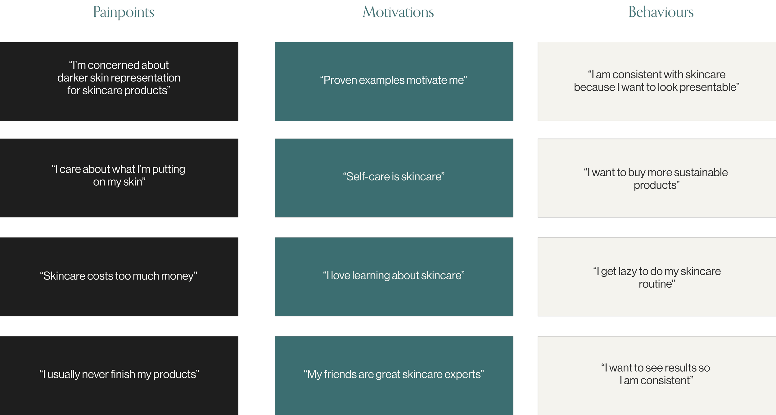
In addition to these insights, I highlighted the pain points, motivations and behaviours of these users.
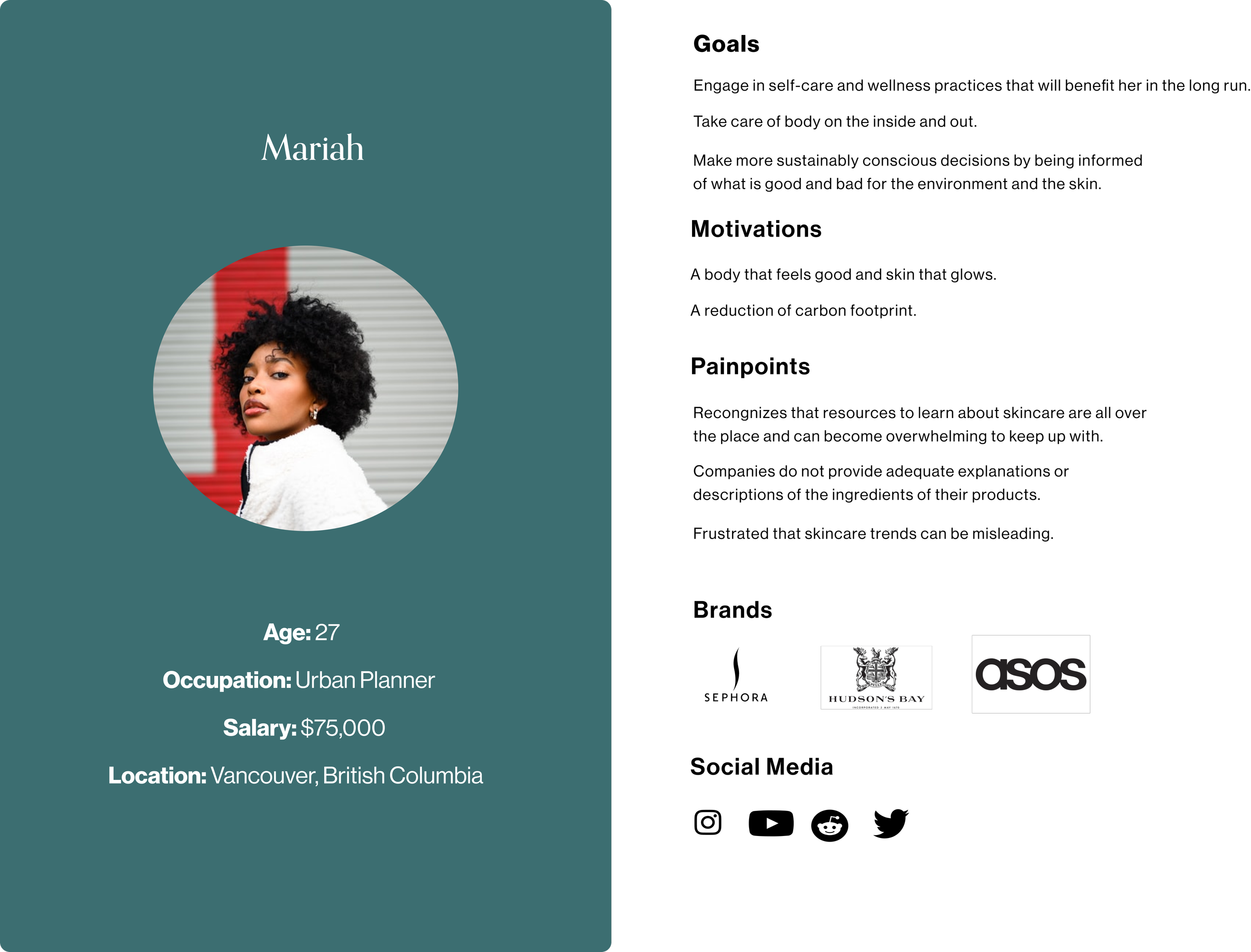
After synthesizing these results, I came up with the following persona - Mariah.
My Skin aims to put less pressure on the user in their skincare journey and emphasize the fact that it does not need to be perfect, but rather progressive. Hence, I made this app called "My Skin" so that the user can feel like their skincare is unique and tailored to them.
User Stories
I then developed potential features for the product based on themes and ideas from the results of the research that was conducted:
DEFINING THE APPROACH & DESIGN OUTCOMES
Based on these results, I decided to design a mobile iOS first solution and explore the idea of a responsive website to potentially accommodate other ideas and features.
IDEATE, TEST AND ITERATE
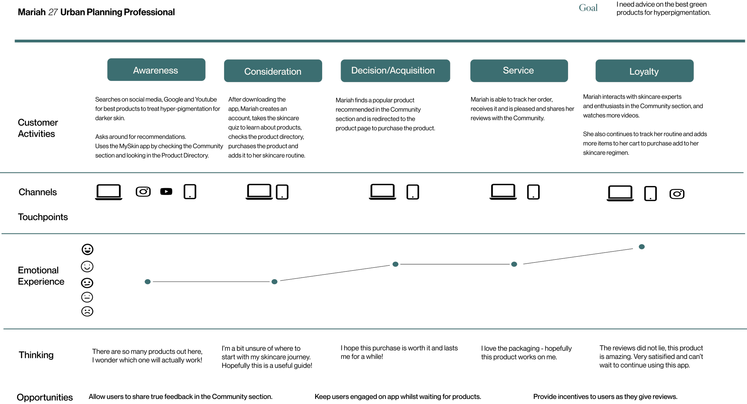
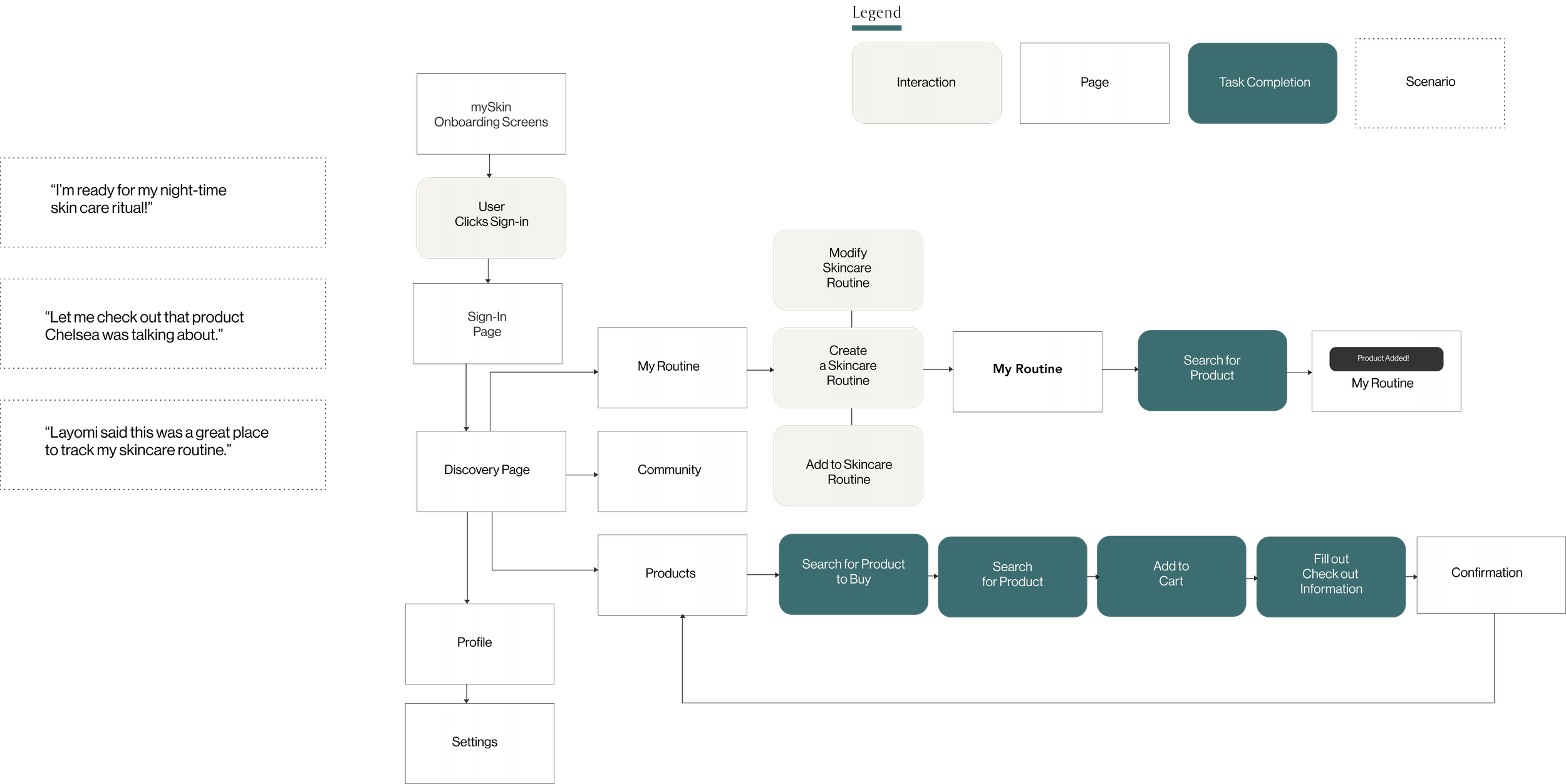
How did I get here? Based on the conclusion of these user stories, I created a journey map, mapped out the information architecture and user flows and began to create sketches and wireframes shortly after.
Journey Map
Information Architecture
User Flows
Wireframes
Usability Test Findings
My initial designs were complex at first, with so many ideas and moving parts. When testing, I realized that users needed a more simplified way of keeping track of their routine and skincare journeys. The first designs also had a mandatory, skincare quiz, it was soon realized that this was time-consuming and it would be more productive to allow them to complete a quiz later and focus on tracking their routine and discovering or purchasing new products.
Key Changes
The community page is a new page I added that I knew would be useful for users that want to be guided on their skincare journey by experienced influencers.
When onboarding, I realized that it did not make sense to include the login button on all pages. I just changed this button to a small link that mentioned “Already signed up? Log in here.” if the user were to reinstall the app for some reason but already signed up.
I allowed users to complete their quizzes after the signup process so that it would take less time for them and they could see the benefits the app has to offer.
DESIGNING THE SOLUTION AND CREATING THE PROTOTYPE
I created a moodboard to guide my vision for high-fidelity screens. I went for a simple, relaxing and natural feel to keep users calm throughout their experience since many of them consider skincare as a self-care regimen.
Moodboard
Style Guide
High-Fidelity Designs
Learning Outcomes
You will not be able to incorporate every idea you have and that’s okay. A simple design is a functional design.
Even though you are a valid user, the solution and design are not about you — be more other-centred.
Your design will not always be “perfect”, there is always room for improvement and constant upgrading. It is important not to abandon your designs when you think you’ve hit a certain point.
I’ve learned that “feedback is the greatest design skill” — both giving and receiving it.
Next Steps
I would like to create a website for this online community. I believe I will be able to do more with this concept if a website and blog were created for users. I also think it would be easier for users to complete tasks like signing in and watching videos of their preference.


